Studio.byYSR
An Integrated Creative Studio. Founded by a lady from Bangkok.
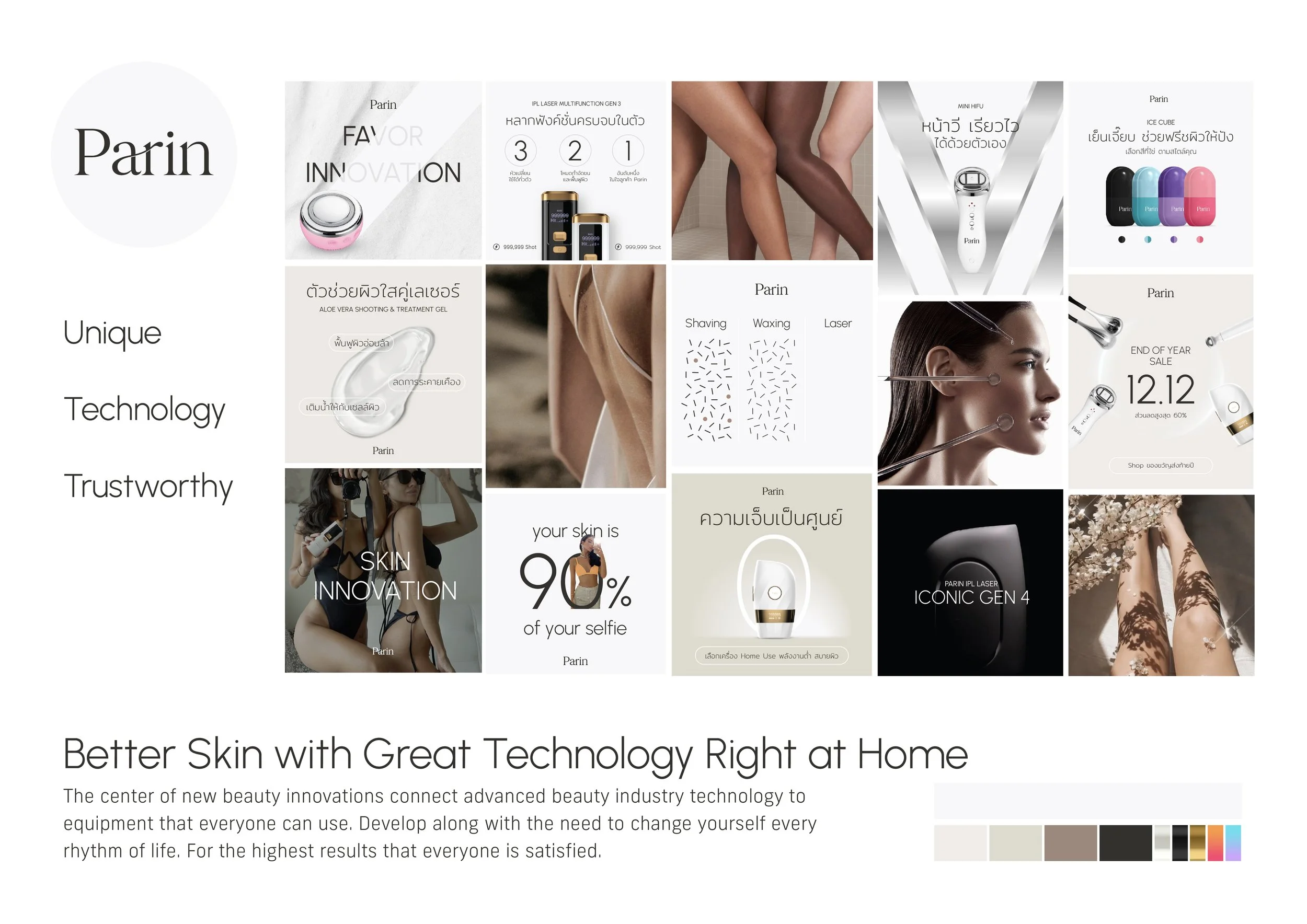
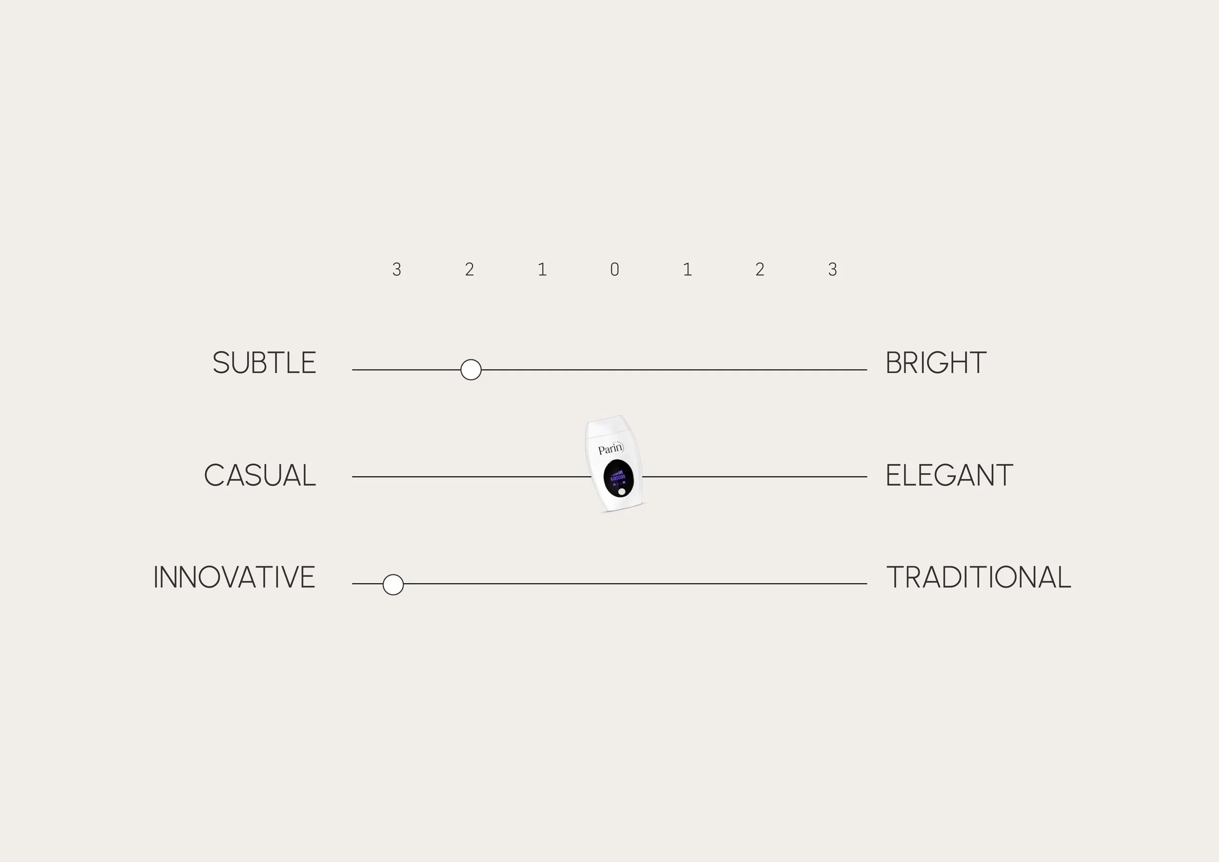
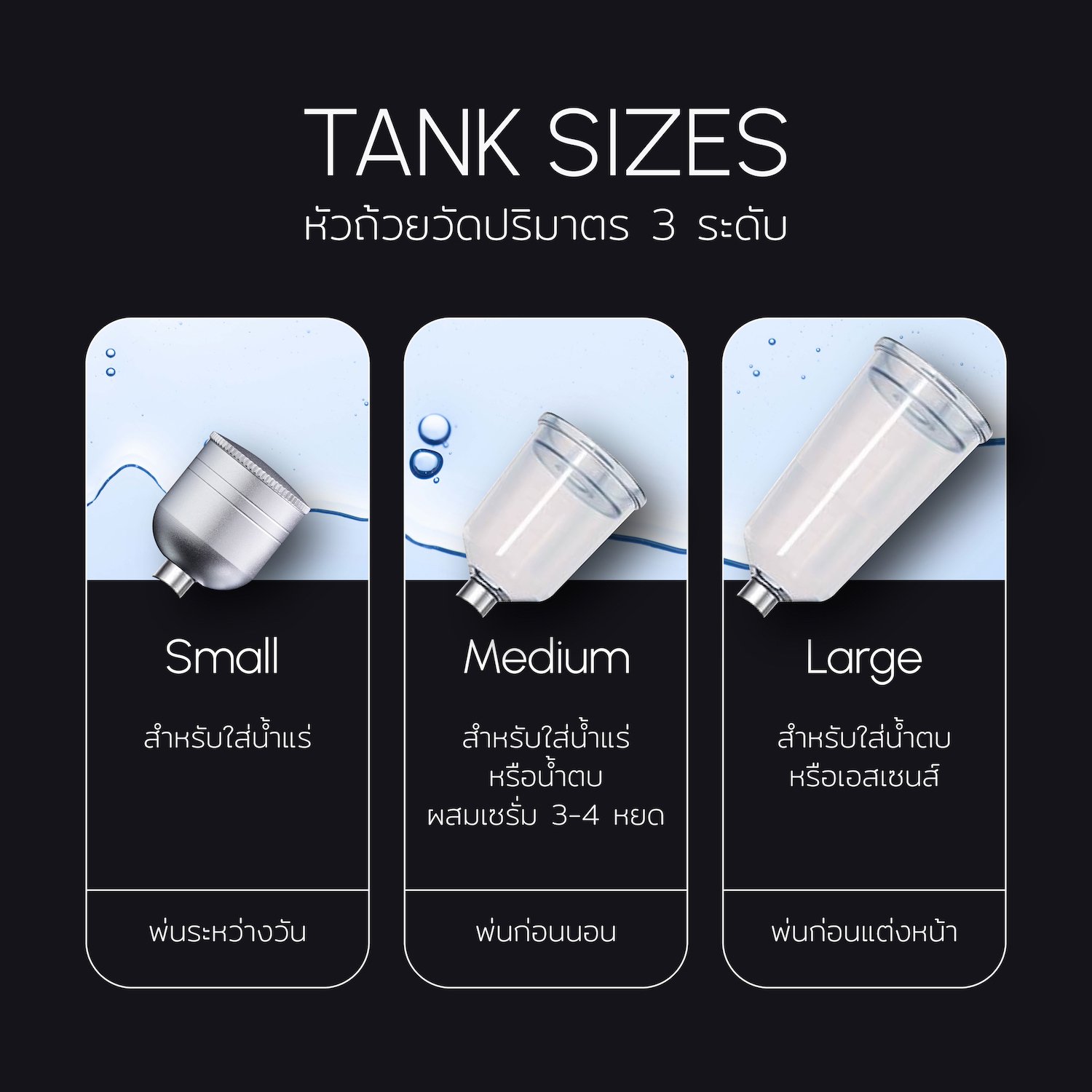
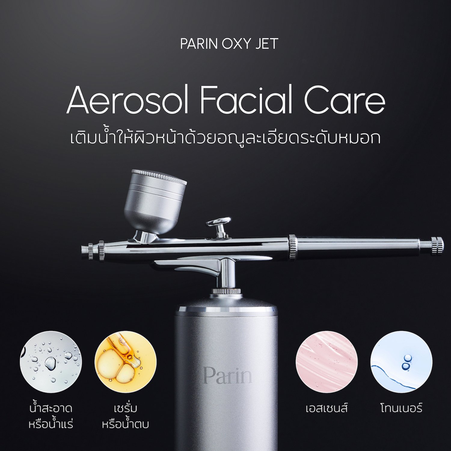
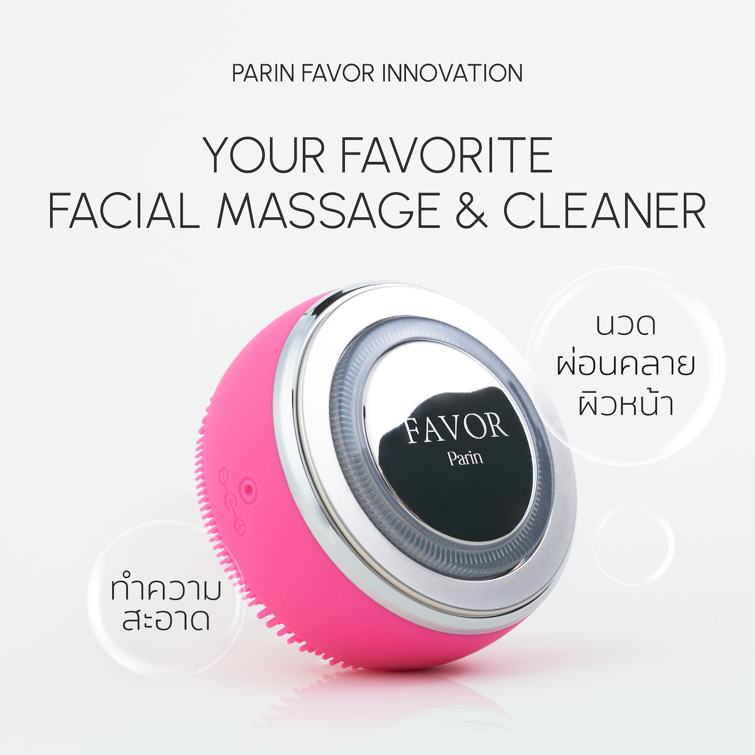
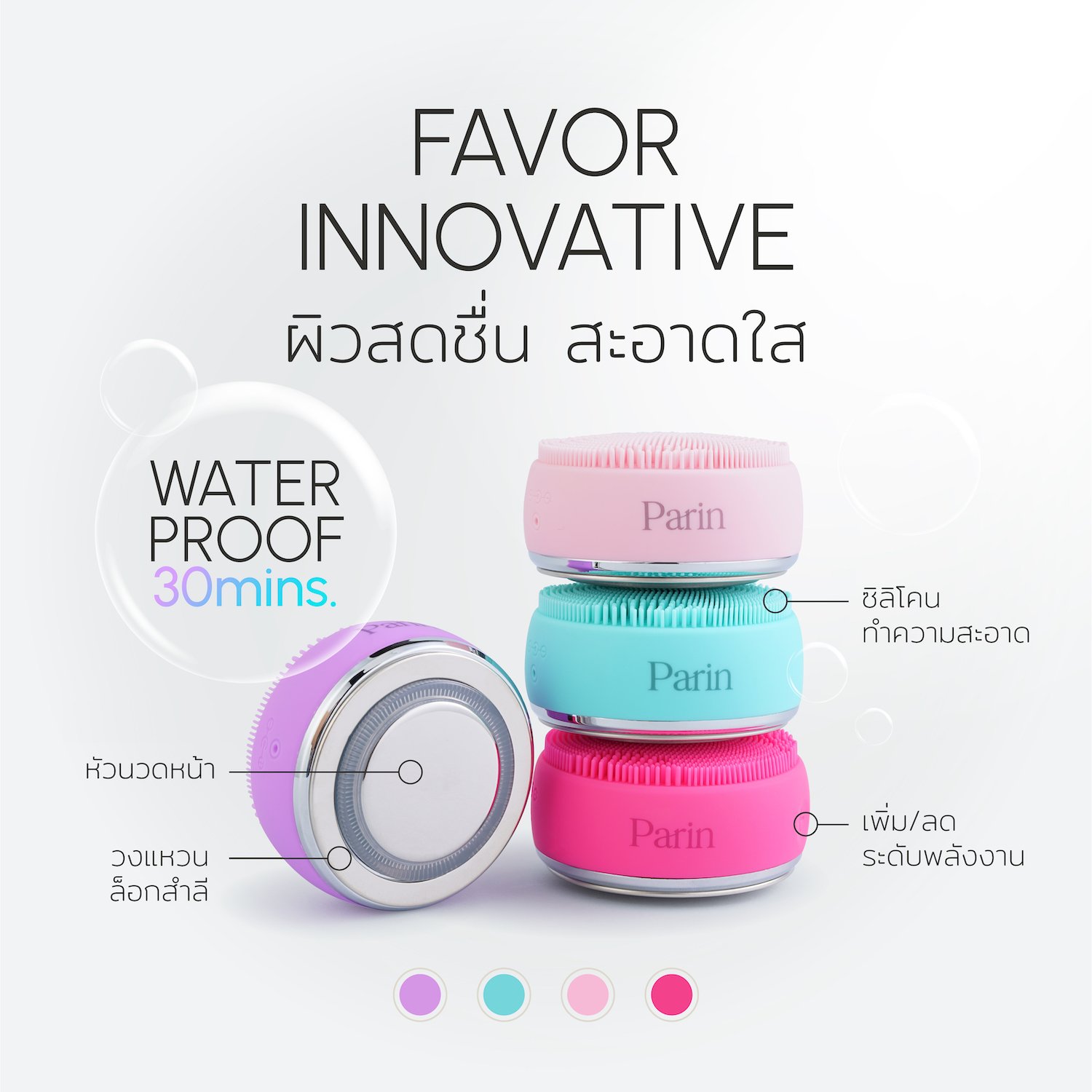
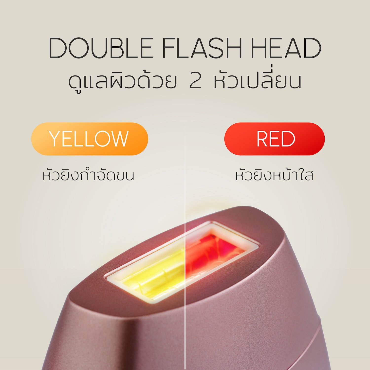
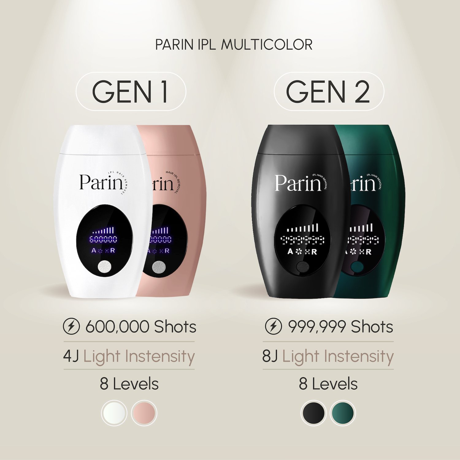
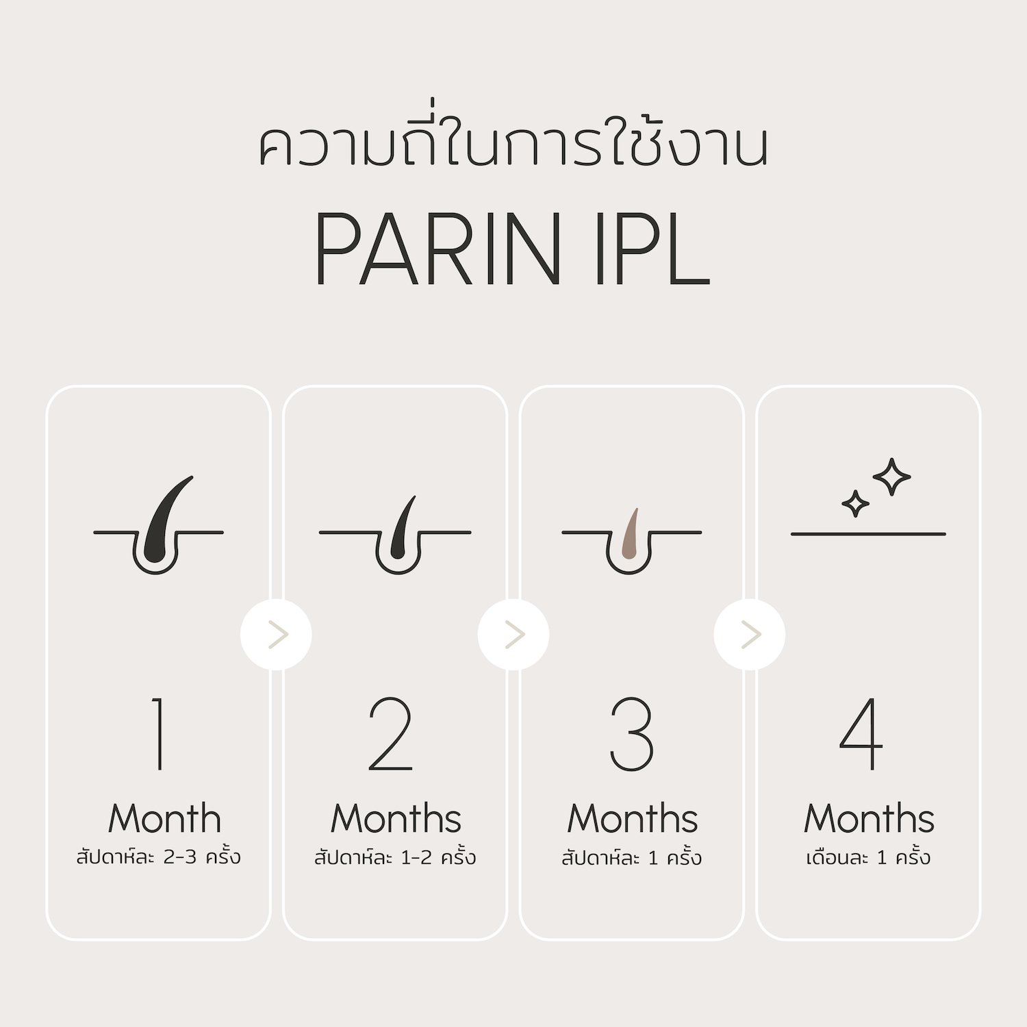
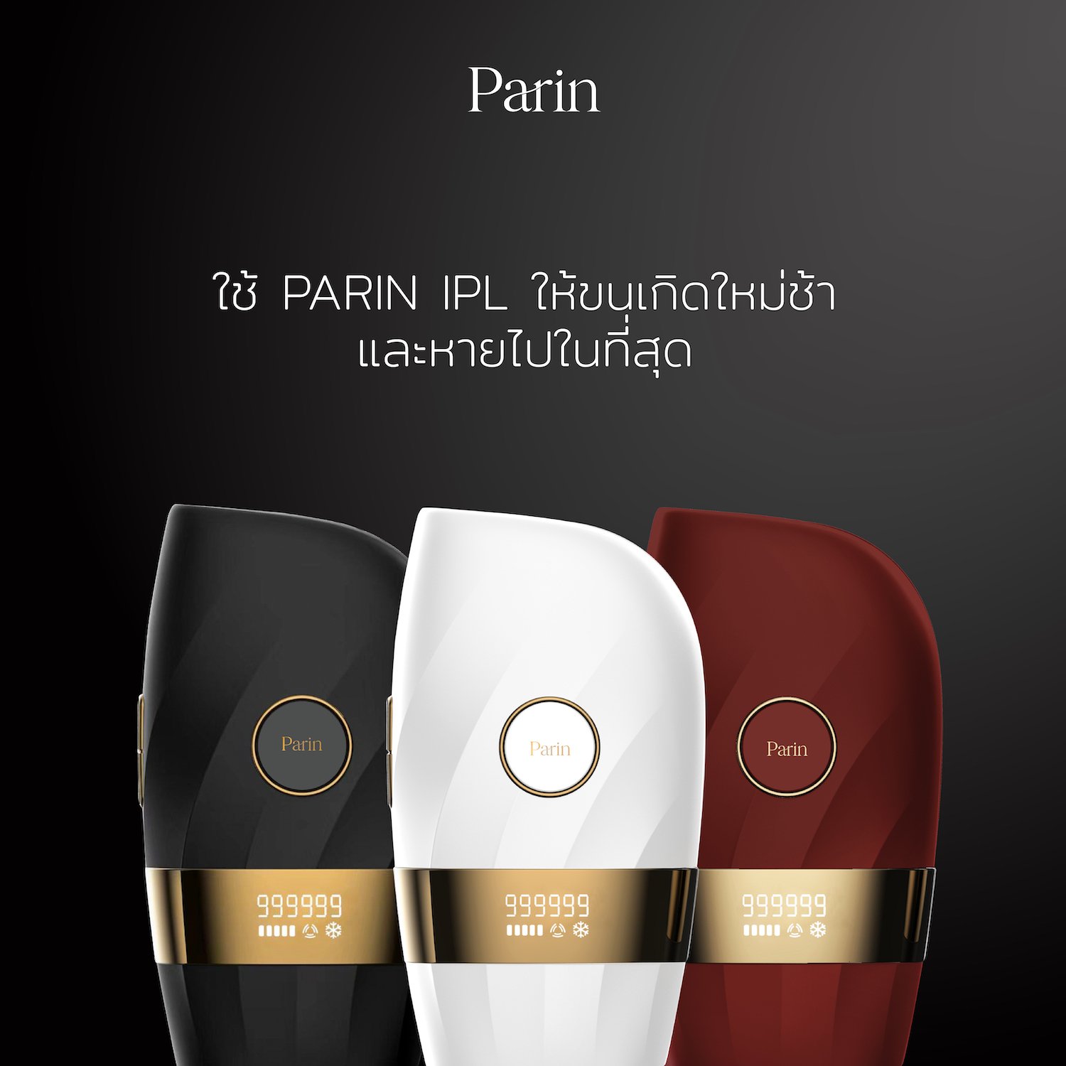
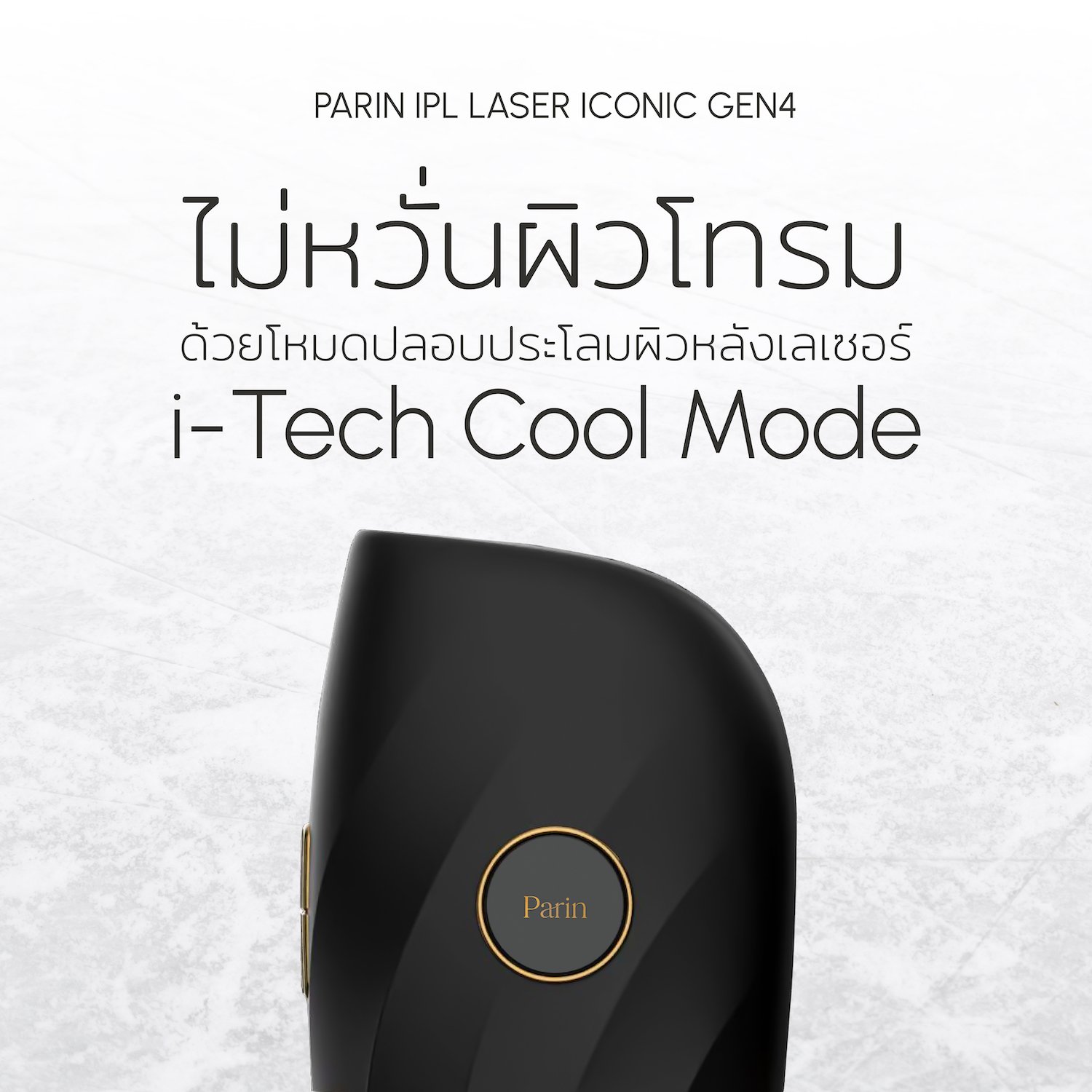
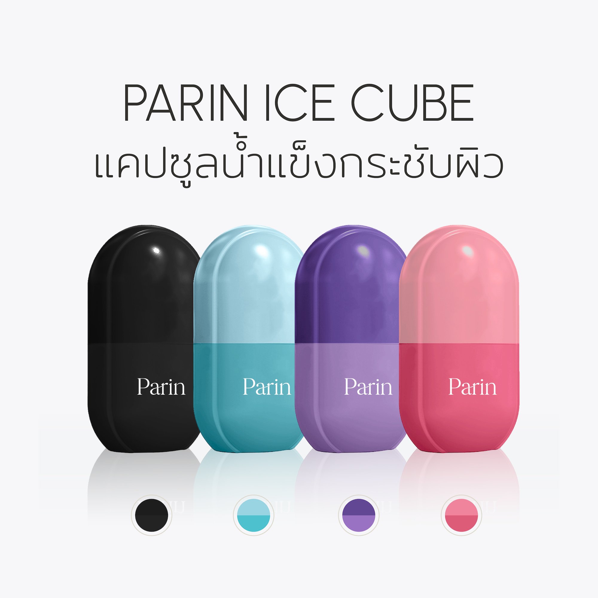
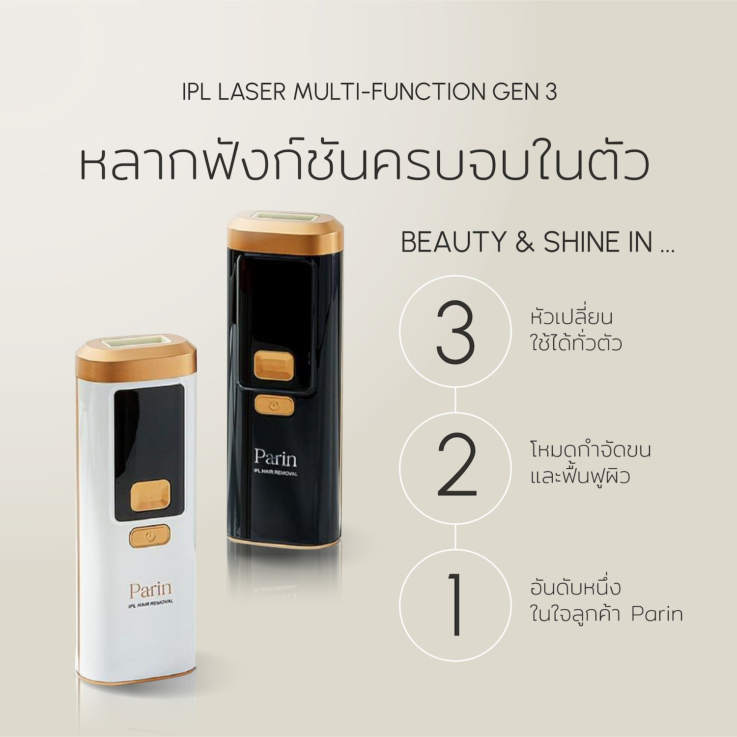
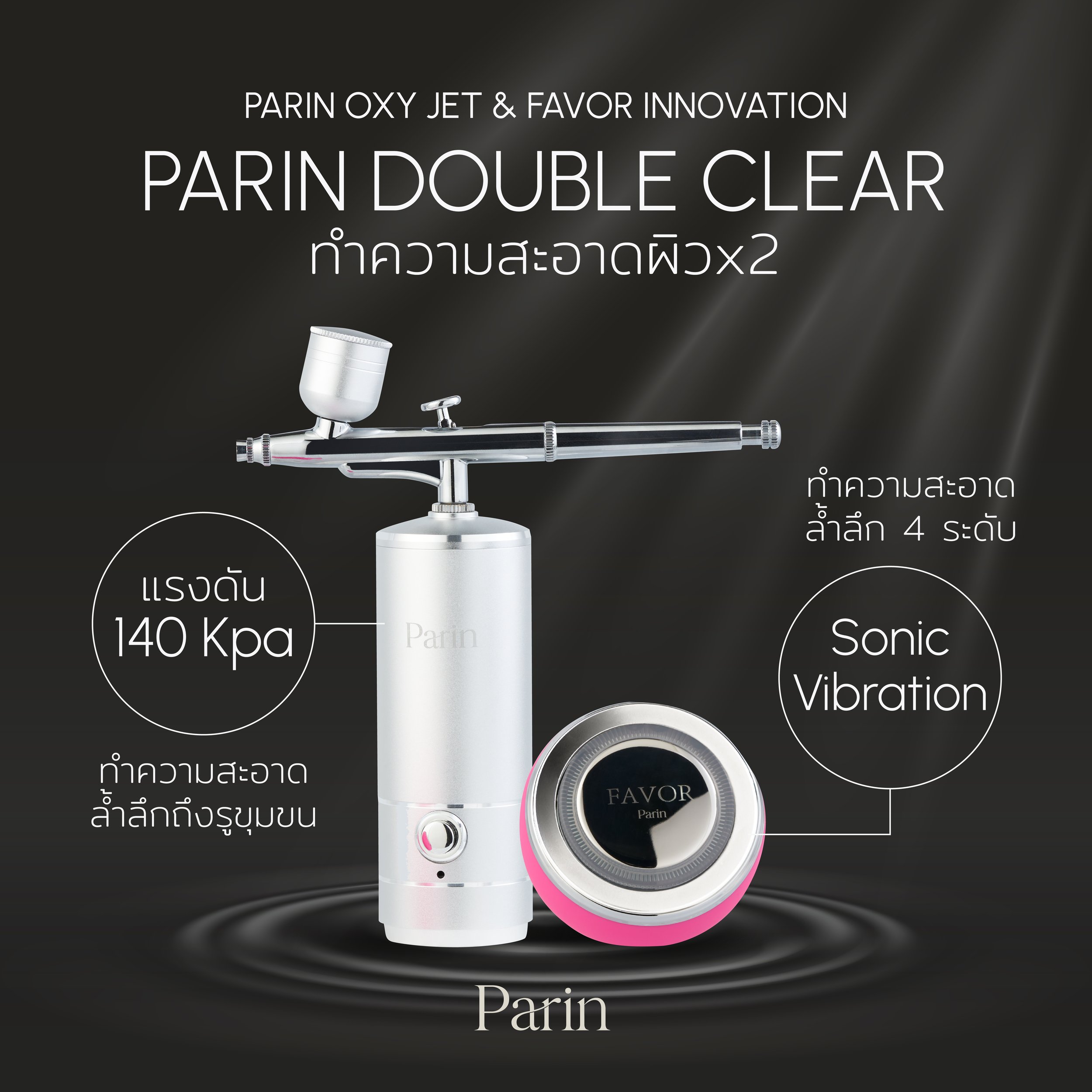
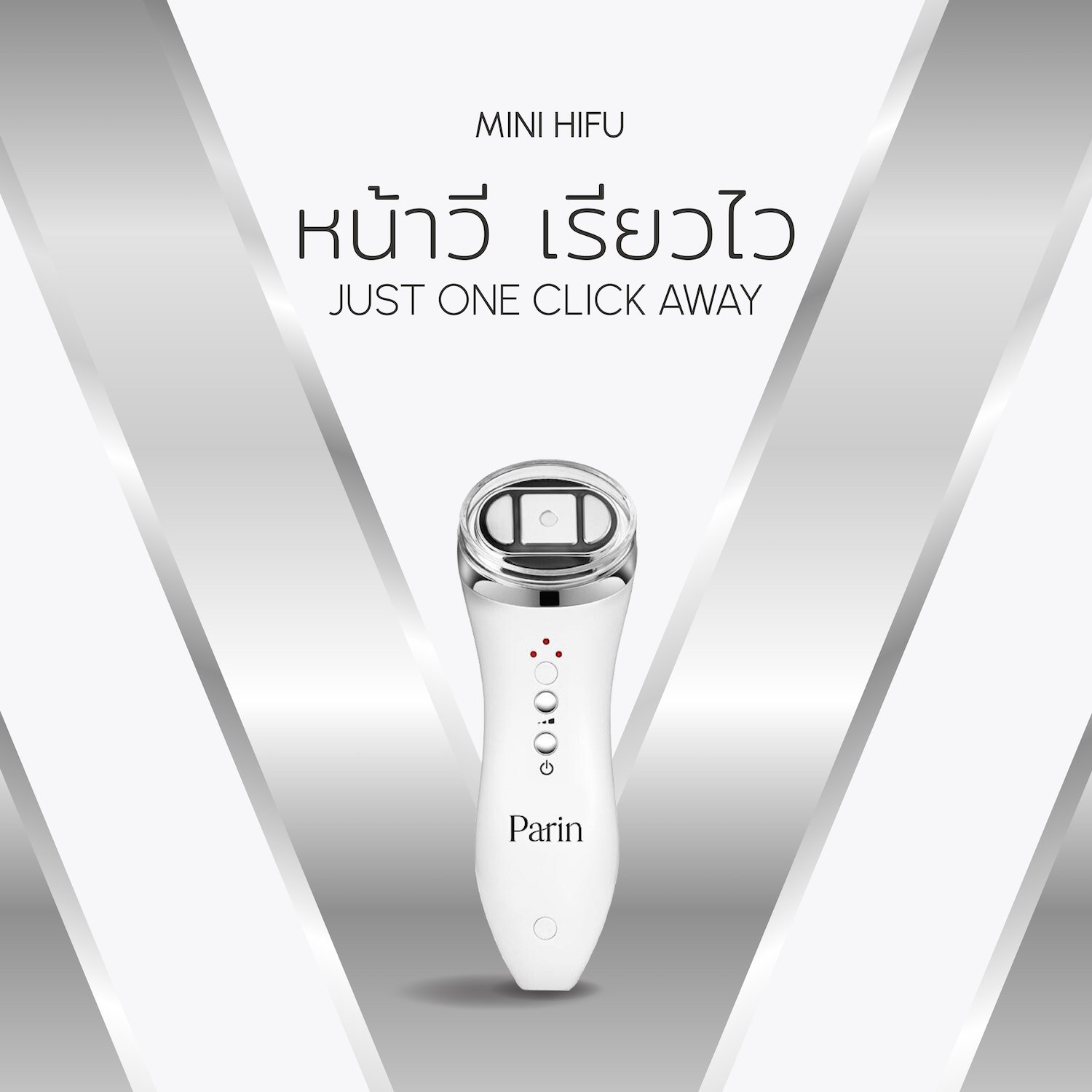
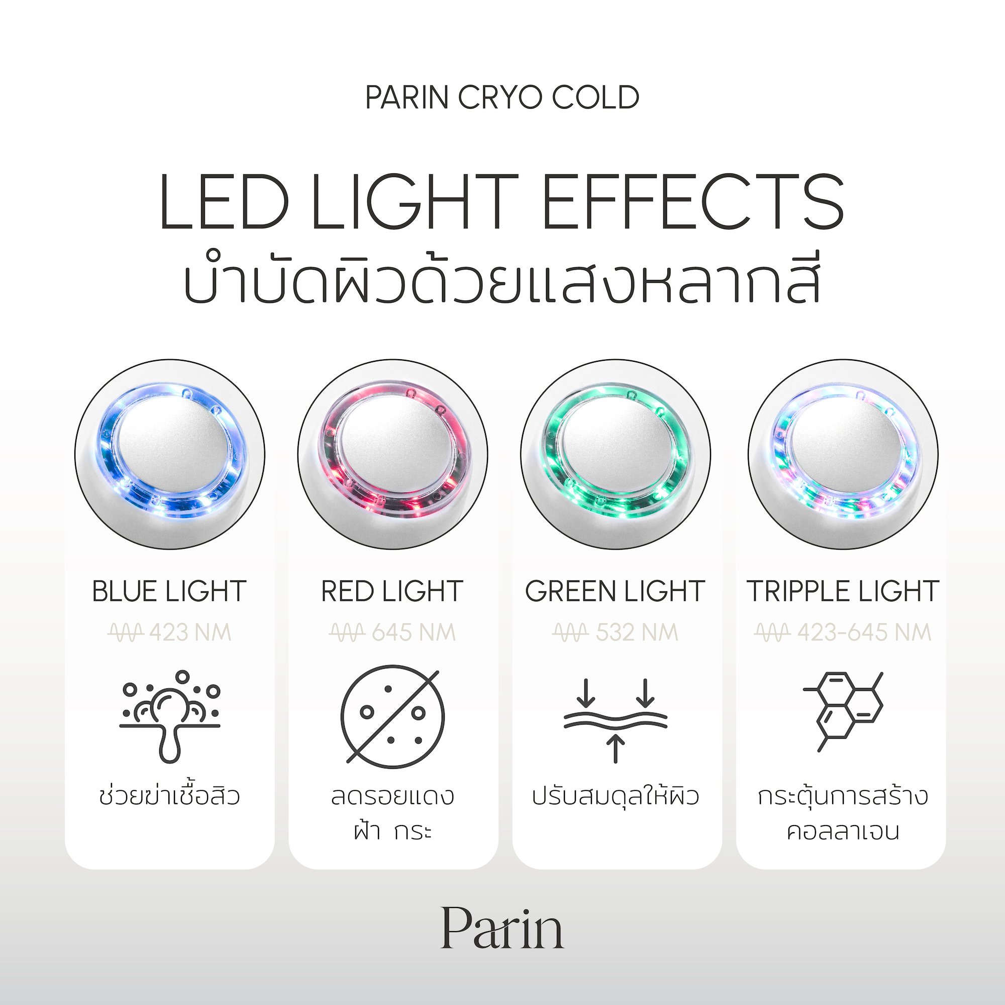
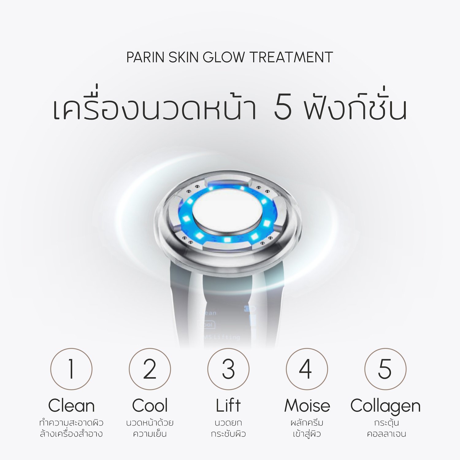
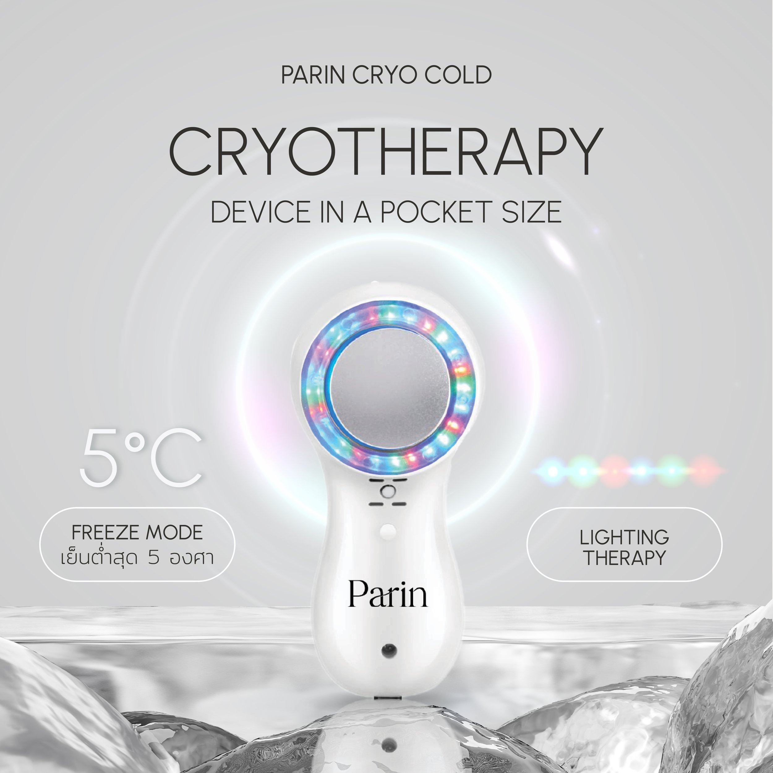
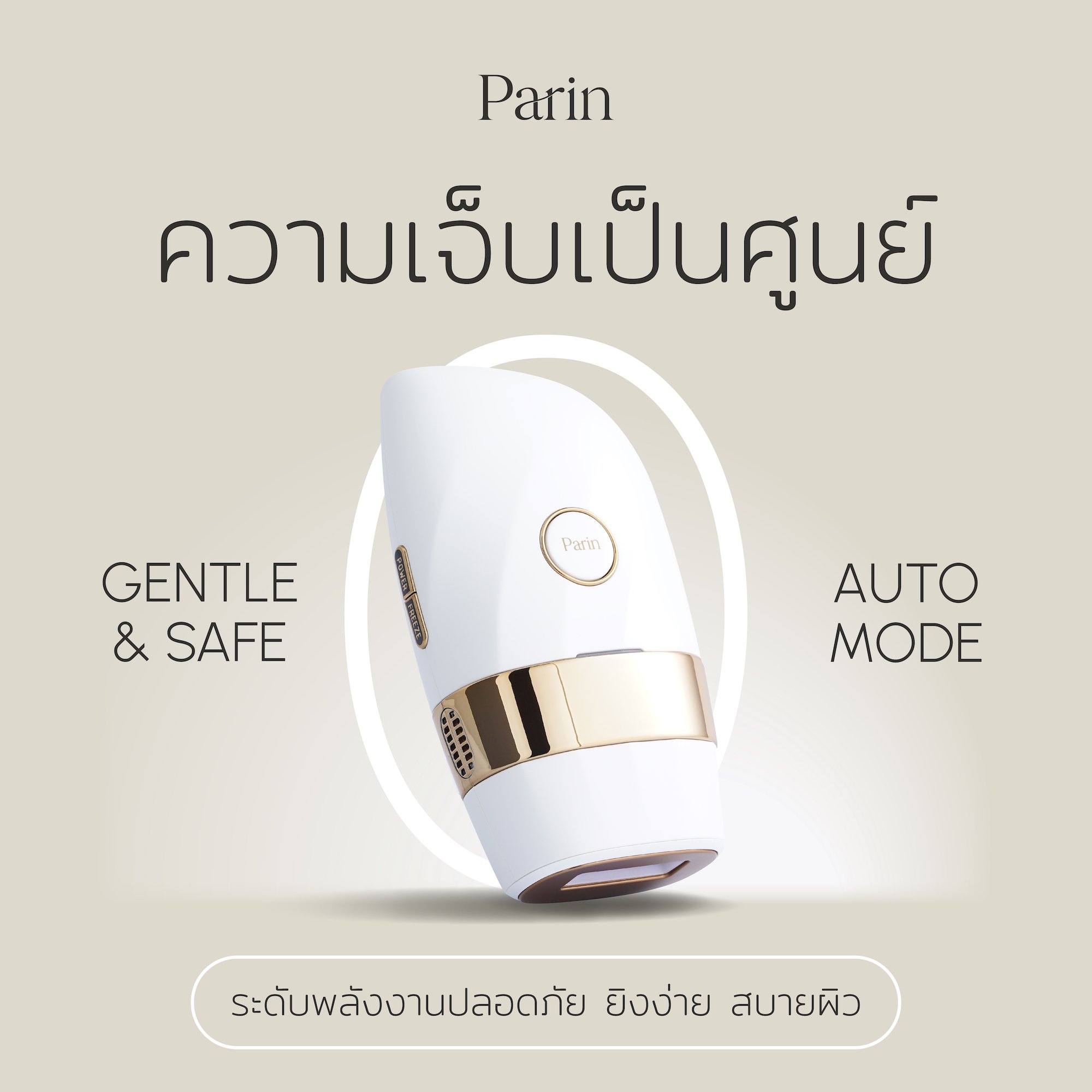
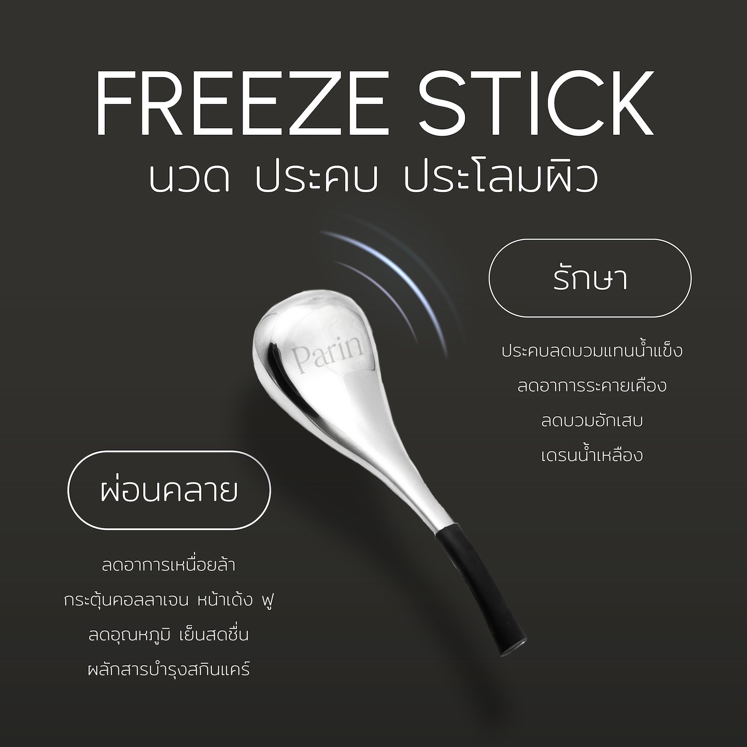
In designing the new look for Parin, our focus was on presenting the brand as a leader in beauty innovation that meets the needs of Thai consumers. We wanted to emphasize the reliability and effectiveness of Parin's technology.
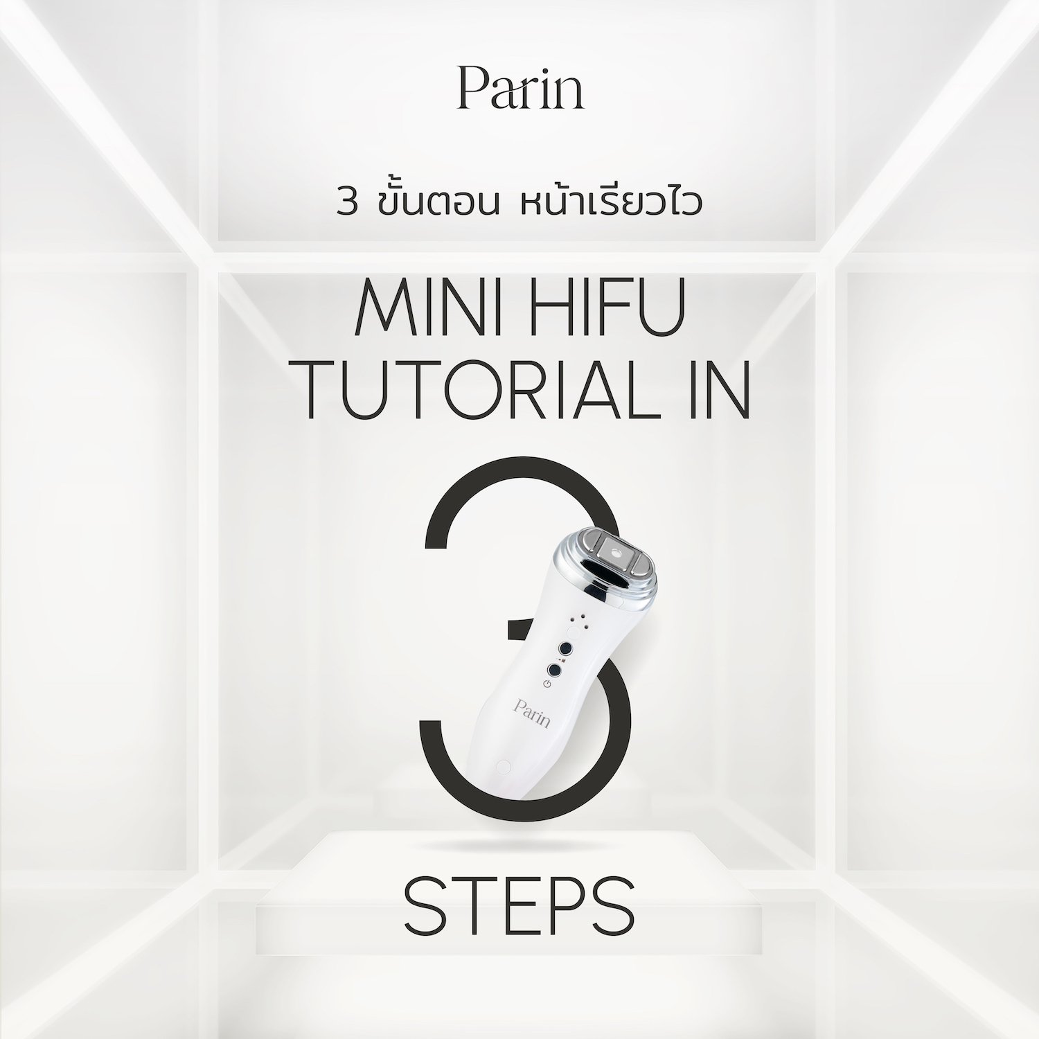
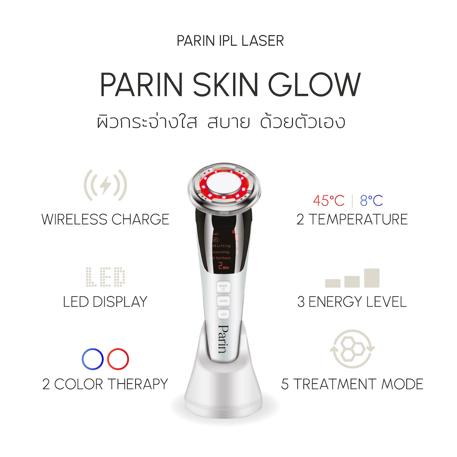
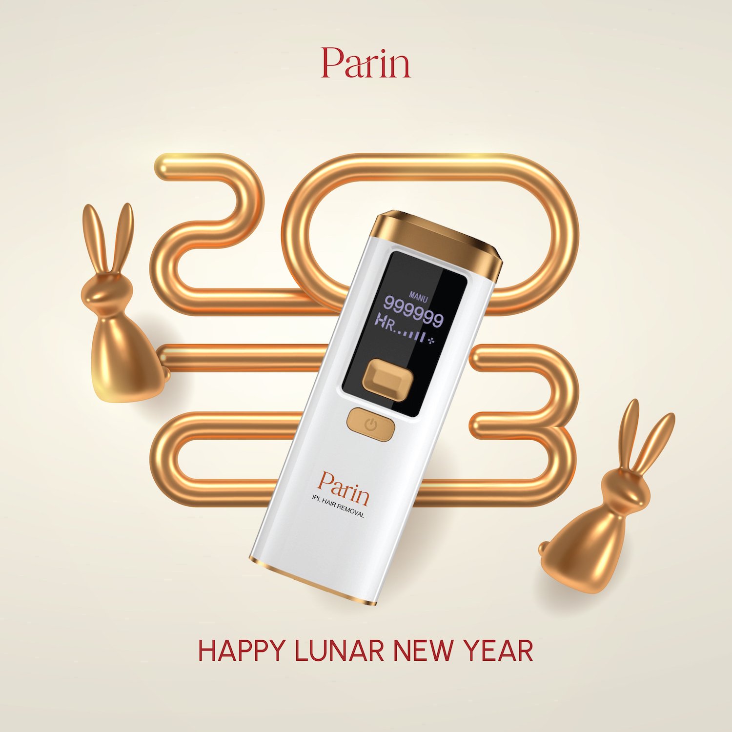
To convey this message, we opted for a black-and-white visual style, accented with a pop of color, to keep the brand image fresh and modern. We used the metallic color of the product itself and combined it with the Nude Tone of the brand to create a unique, innovative approach to self-care products.
Our design approach for Parin was centered around showcasing the brand's commitment to quality and innovation while also conveying a sense of accessibility and approachability. We are proud of the final result, and we believe that the new brand image will resonate strongly with Parin's target audience.
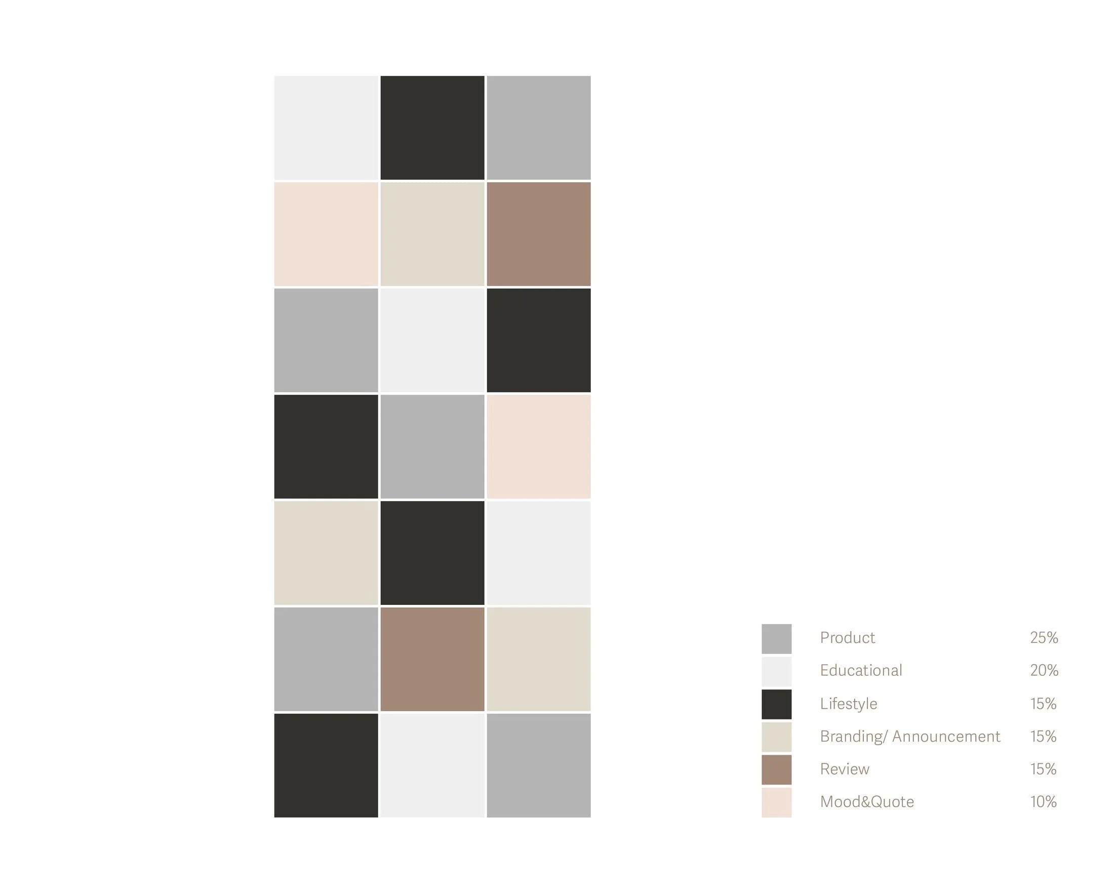
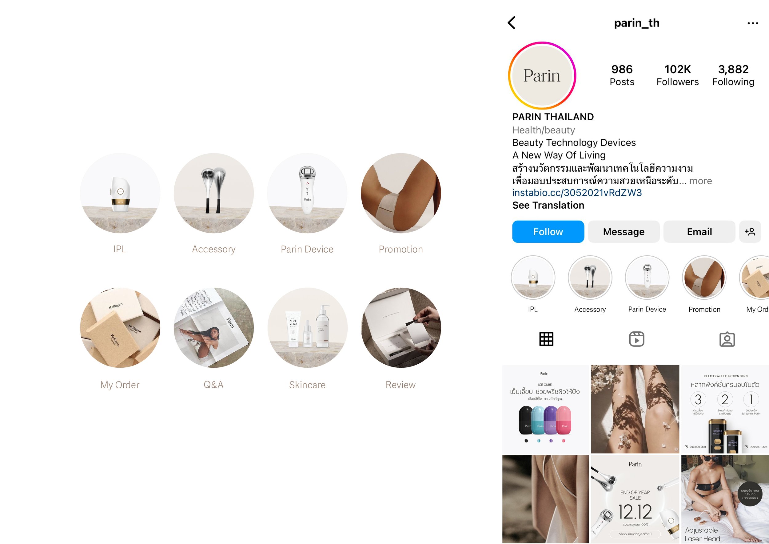
It's clear that the new brand image has had a positive impact on Parin's social media presence, and we are confident that with continued effort and strategic planning, we can continue to grow and engage with the audience in meaningful ways.
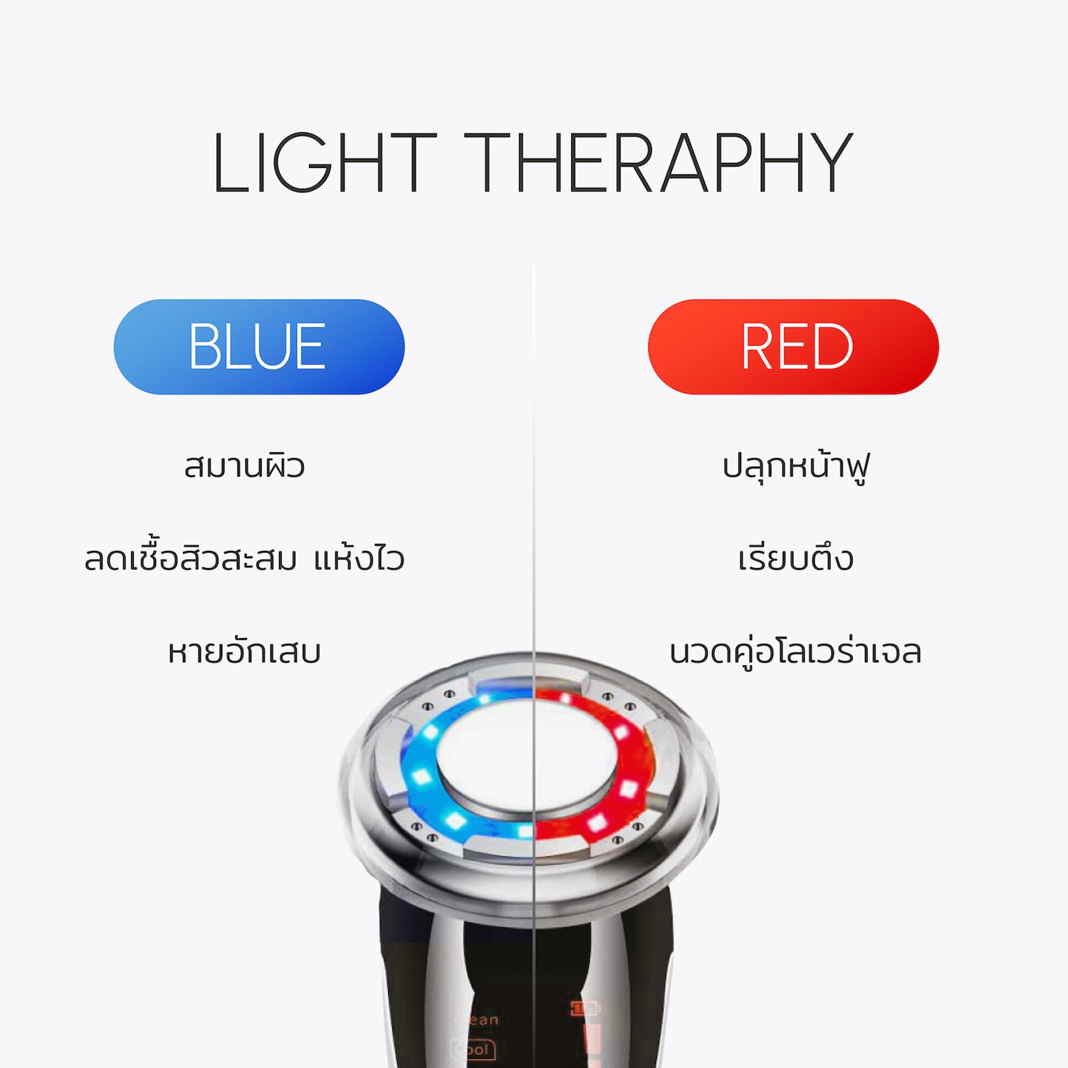
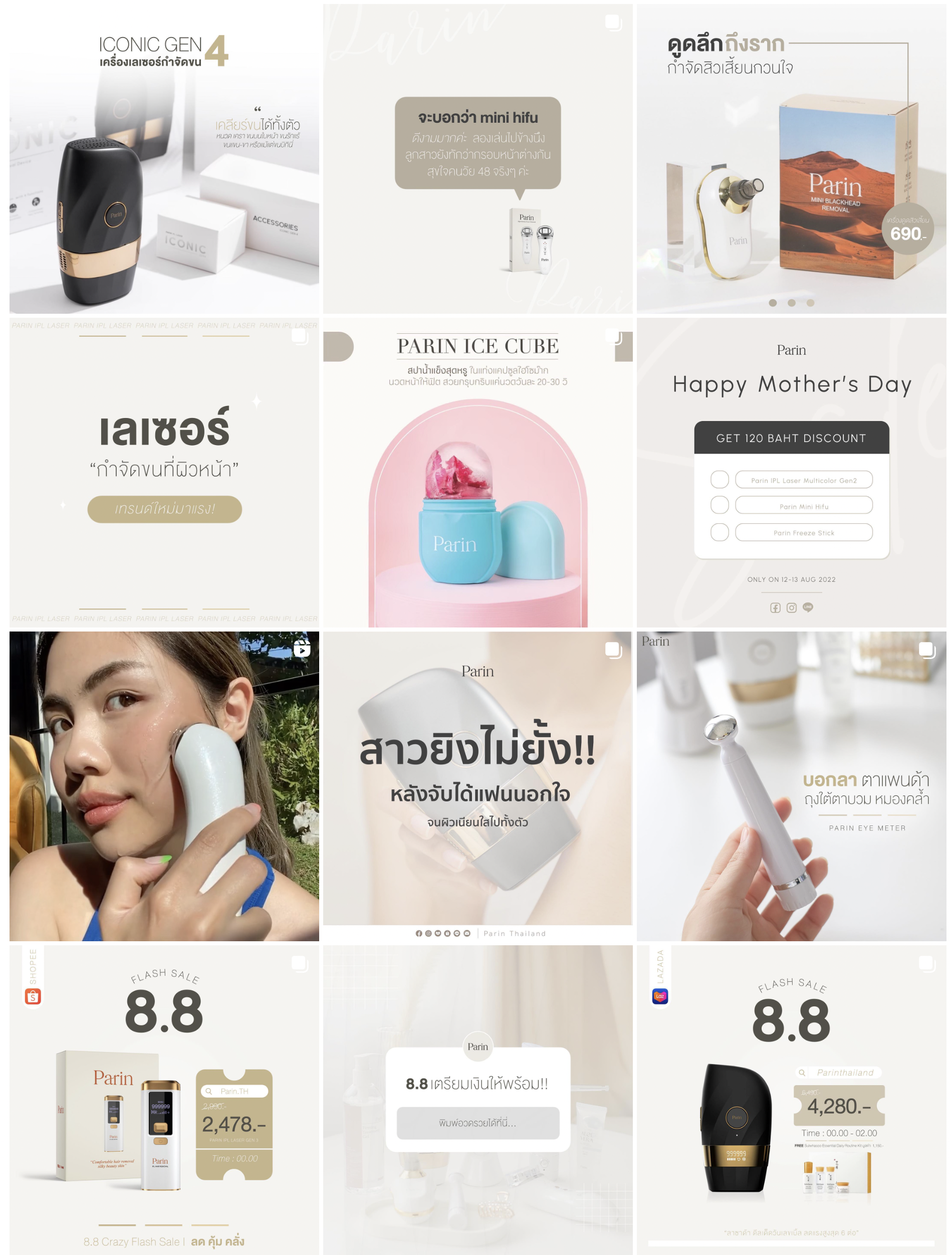
Ps. This is Parin’s contents before the rebrand >
Just so you see the Before and After effect.
As part of our brand refresh for Parin, we strongly recommend creating a professional-looking Lazada store to complement the new brand image. By creating a professional-looking Lazada store, Parin can elevate its online presence and provide customers a seamless, enjoyable shopping experience. We believe that a well-designed Lazada store is an essential component of Parin's ecommerce strategy, and we are confident that it will help to drive sales and increase brand awareness in the online marketplace.
